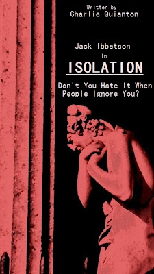
 This is the final poster design. I decided upon the red statue picture and used it to 'bleed' to the edges of the page, because I feel it not only looks the most eye catching but also has many pragmatic links to the short film. Red connotes many things, the foremost being red connoting blood and death and also hinting at the danger in the film. The poster also leaves the main plot line ambiguous which is a factor I took from the Machinist poster I evaluated. The title font is in white in contrast to the black to make it stark and stand out. I composed the picture with the title not at the head of the page as is often done with more formal posters, this was to give a more arty style and also it is a feature I have seen in other poster of the same genre. I put in a tagline from the film to use as a sort of slogan that would interest people and give a small idea to the plot line. At first I had put in stars as a review under the title but I believe it did not work and put too much on the poster, which I wanted to be quite basic and focused on the bleeded image.
 Overall I believe the poster has come out well and fits in well with the film project. It does need some finer points like the credits at the bottom of the poster that give an authentic look to the poster. However I feel the poster and picture would be associated well with the film and is quite striking.
No comments:
Post a Comment